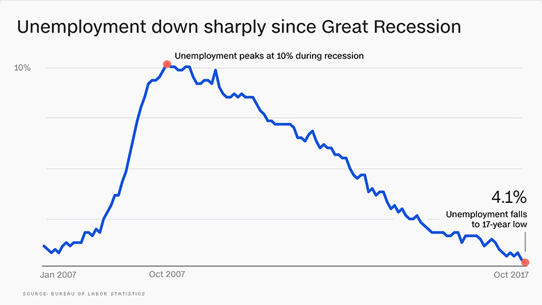
Overview: The graph above shows the unemployment rate between 2007 and 2017. The dots highlight the peak of the recession and all-time high unemployment for this time period, as well as the low unemployment after nearly a decade of recovery. However, this graph is very poorly designed. The X and Y axis are not consistently labeled, and the X axis uses both months and years in its timespan. Like Chapter 10 of Dr. Cantu's book, this graph helps demonstrate the importance of teaching students economics. Students must be able to understand how the economy affects history, as well as how to analyze data and graphs and identify bad information.
Screencast: Screencast 18
Big Question: How can teachers make a "boring" topic like economics interesting for students?
Interactive Site: The interactive site I chose for this screencast is called Investopedia. Specifically, Investopedia has a simulator which uses real-time stock pricing to allow students to manage a virtual stock portfolio to see how the market works. It is an excellent tool for teaching students how the market functions and how traders make decisions.
No comments:
Post a Comment